XTRF: Brains and Beauty
One of the really appealing things about taking a course like Introduction to Project Management is that the resources available to you as a student far exceed what you would be able to access if you were a simply making your way into the market and gathering information on a job-by-job basis. This, aside from being an amazing learning experience, enriches the field of experiences you have to draw on later in the field, making you a more flexible, aware and creative professional. Or, at least, I hope that’s what it does.
In any case, one of the most valuable opportunities this class has provided me with was an opportunity to learn to work with XTRF—a very shiny platform with a pretty high price point, intended for large firms that are doing a lot of translation work with a lot of clients, as well as bringing in a lot of money. As someone just starting to make my debut in this field, it’s highly unlikely that I would have had a chance to work with this platform as intensively, creatively, and multifacetedly as I have in this class. Our access to the platform has allowed me to see the platform from a multitude of points of view (client, firm, vendor) and… quite frankly… fall in love.
What’s the Big Deal?
You might laugh, but one of the things that’s absolutely enchanted me from the moment I started working with XTRF was its aesthetic presence. I may be a translator by trade, but I have some graphic design experience and from the very moment I logged in, I knew XTRF would make my eyes (and by proxy my soul?) feel at ease.
Project management—or if we take it to the basics: running a business—is a very complicated process, especially at a corporate scale. There’s a lot of things to factor in, and boy does visual appeal sometimes get lost in the process. When you’re working on the scale of a freelancer, it’s totally fine if you do your books, quotes, and project orders in Excel. Most of the back-end only gets seen by you, and it’s your system, so there’s no one to educate.
As your scale increases, and the number of people working with your system increases, so does the potential for mistakes and misunderstandings. Your employees have to be educated in your system, and your system has to make sense to everyone on the team. Once you get to a corporate level, you’re logarithmically complicating the matter: not only do you have a whole chain of people (CEOS, lawyers, salespeople, engineers) involved on your end, but you’ve also added vendors and clients to the mix. For a program to do that effectively, it has to combine power and functionality (for maximum effectiveness) and great design (that’s accessible to all levels of the people who will be working with the platform).
Working, mostly from the translator end, with programs in the TILM field, I’ve had my fair number of angry internal monologues about poor user interface design, but XTRF has exceeded all my expectations in spades.
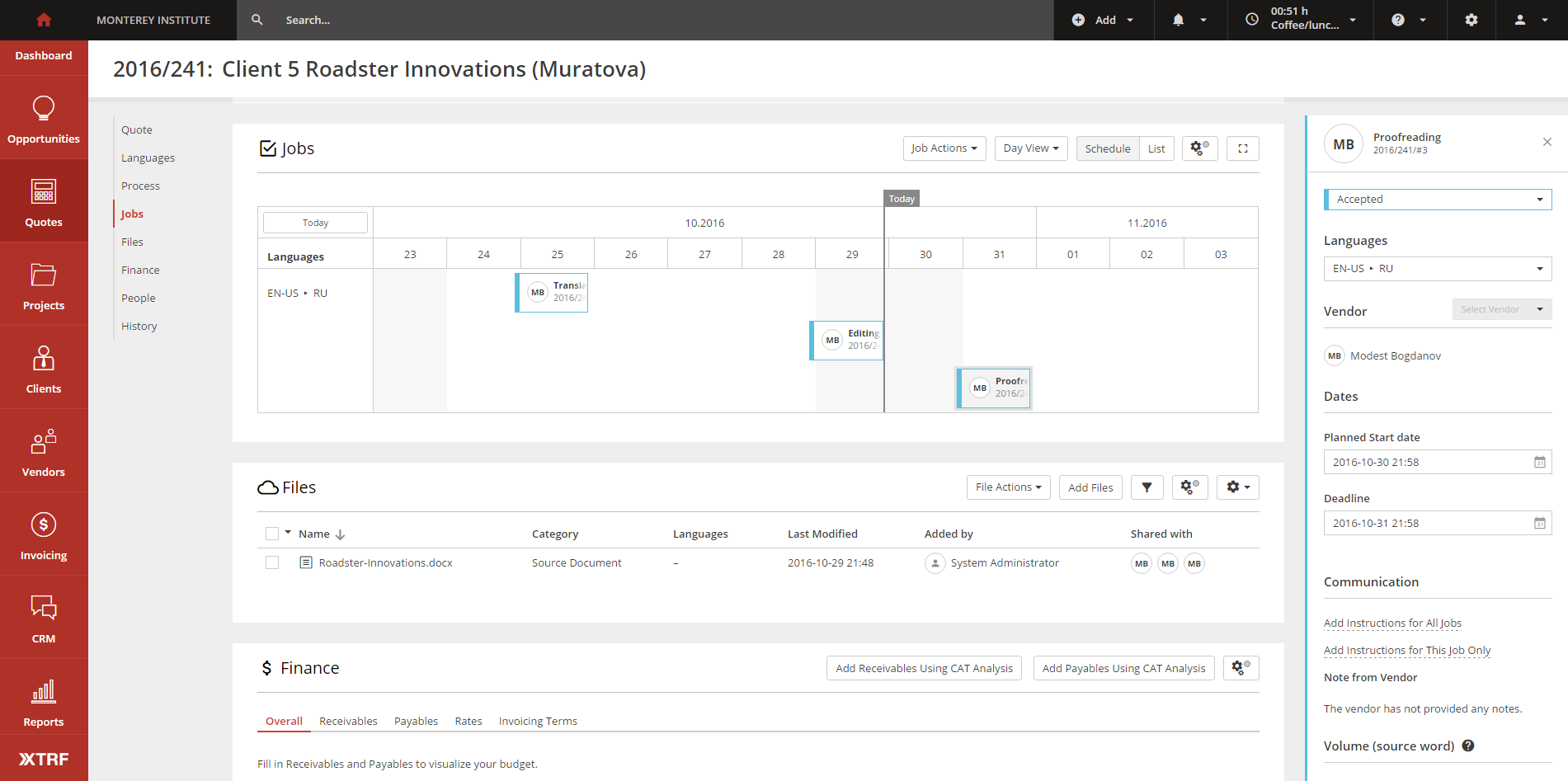
Size matters—XTRF respects the rules of letting size and visual placement on the screen dictate what the user should pay attention to first.
Accessibility and the Aesthetic Logic of Airports
At the start of the millennium, our approach to aesthetics was turned sideways buy a little company called Apple. You may have heard of them. Think back to the ingenious wheel on their first iPods, and maybe you’ll get why I like to say that they hearkened an Age of Minimalism upon all of our heads. Not everyone uses minimalism effectively, but the most impressive uses combine visuals, systems, biology, and physics in a way that makes navigating systems intuitive and easy to learn.
XTRF takes my breath away with all the work it has done to make its system not only rather impressively comprehensive, but also visually tailored to each type of user.
There’s little thing I like to call the Airport Design Rule. This rule or, I guess, this approach to design, is one where you assume your user just came from a 17-hour-long flight, is tired, and doesn’t speak the local language. (If you’ve ever had the chance to visit the first floor of UCLA’s Young Research Library, they’ve got this design rule down to a T —simply switch out out exhausted travelers for college students on the tail end of an all-nighter). Their mental state has compromised their logic and language skills, so the airport needs to use simple and clear visuals that an exhausted, barely-thinking person can follow and understand. A well-designed airport will allow the exhausted travelers to get around while the awake people behind the system (security, airline, and service professionals) can keep it running smoothly and without interruptions, leading to greater efficiency and increased satisfaction for everyone involved.
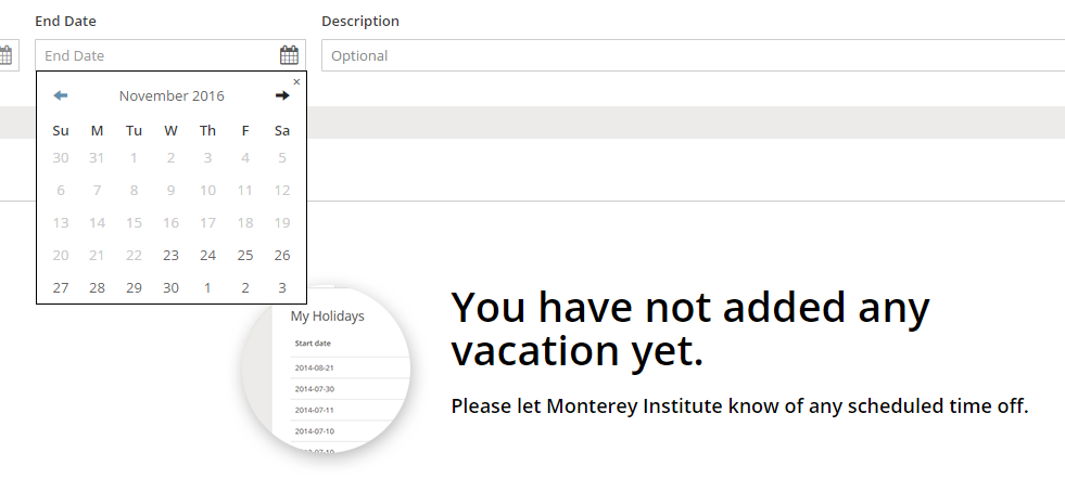
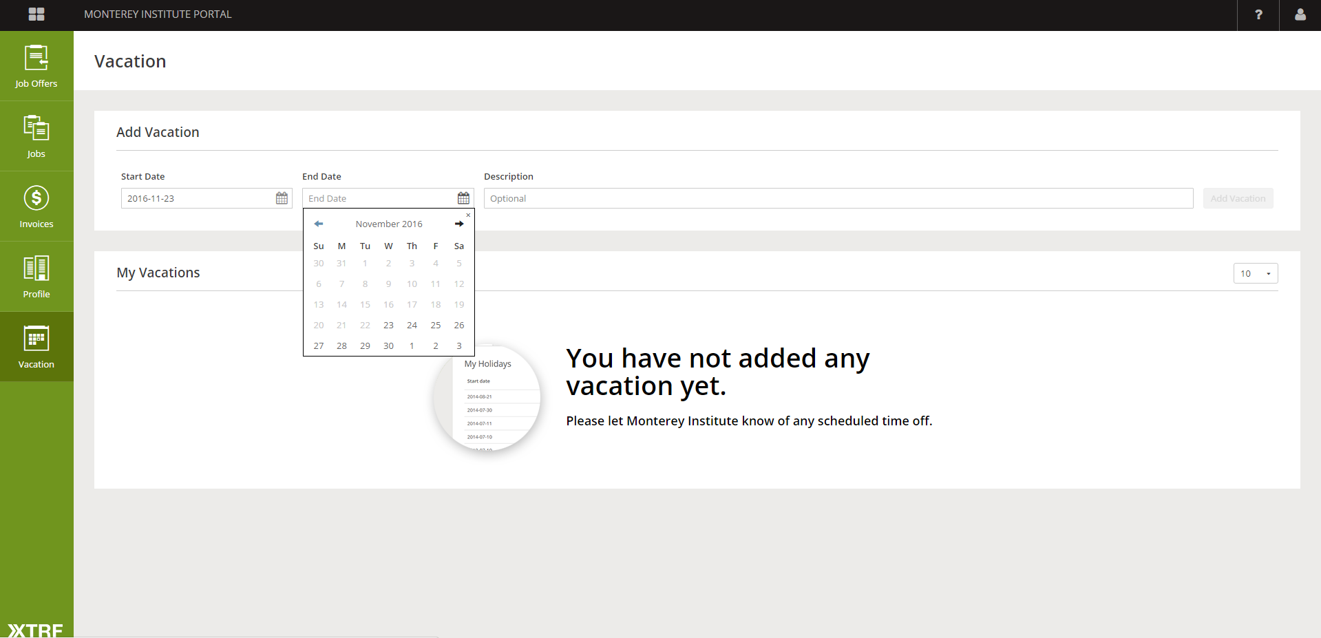
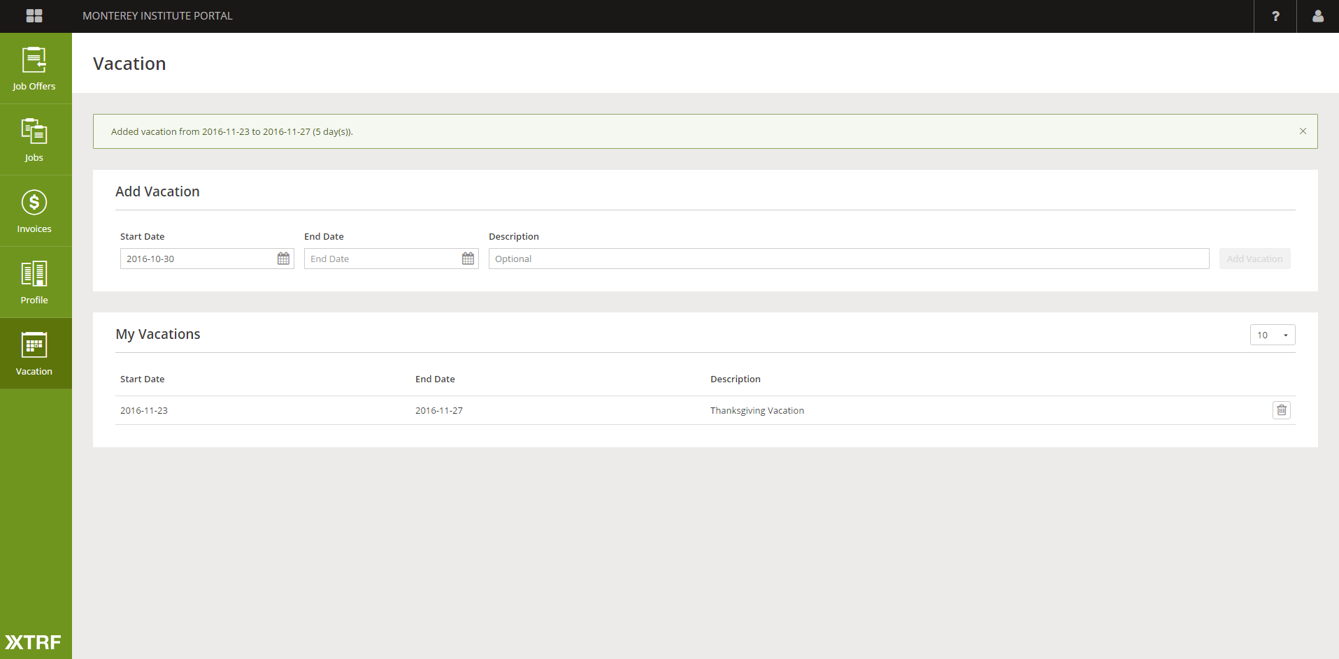
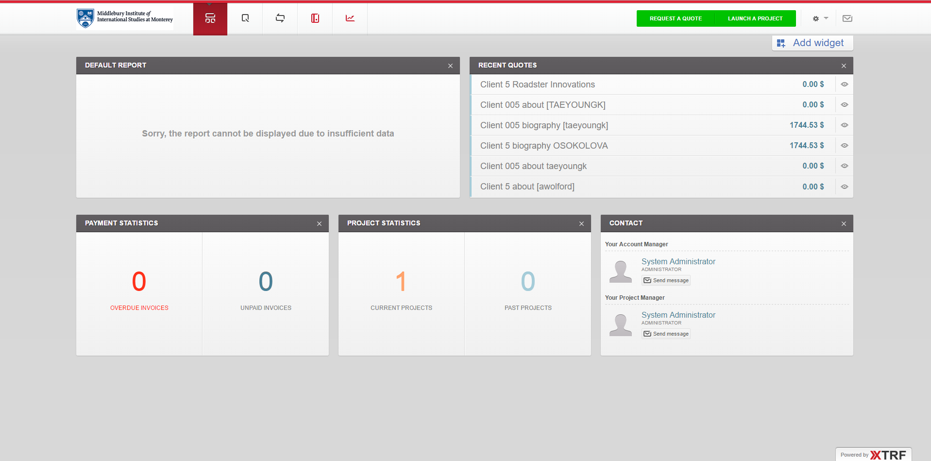
XTRF does this beautifully. One of the most obvious ways this comes across is the visual presence of the portal for each type of user:
Beauty Ain’t Everything
Of course, looks and ease of use are only half of the problem. The platform also needs to be robust and deeply useful. There’s no use to a well-layered modular design if there’s no functionality to populate the modules with.
To the extent of my experience with the platform, XTRF also holds to this end of the bargain. They allow you to collect an impressive and sometimes breathtaking amount of information on your vendors and clients, they automate a lot of the most headachy parts of the TLM process, and they allow you to tailor a lot of stuff to your needs. You don’t feel limited by the platform, like you might with Basecamp.
That said, there are some problems: the system is sometimes slow. Sometimes the depth of features results in a hit to the ease of use, especially in the case of the vendor. There are some things that beg training and communication with the vendor outside of the system. The client portal is better in this regard, it includes a lot of friendly tutorials if the need be, but you’re still not alleviating the need of the PM to mediate between the client and/or the vendor and the technology at some points. However, I feel the number of features and efficiency of the system make up for the learning curve that the PM will need to mitigate.
In the end, if you’ve got the volume and money to afford it, XTRF’s high price point justifies itself, because it takes a lot of what is usually another headache for someone in the business and turns it into a smooth, intuitive system that is attentive to the needs and interests of its users, regardless of where in the process they may come in.